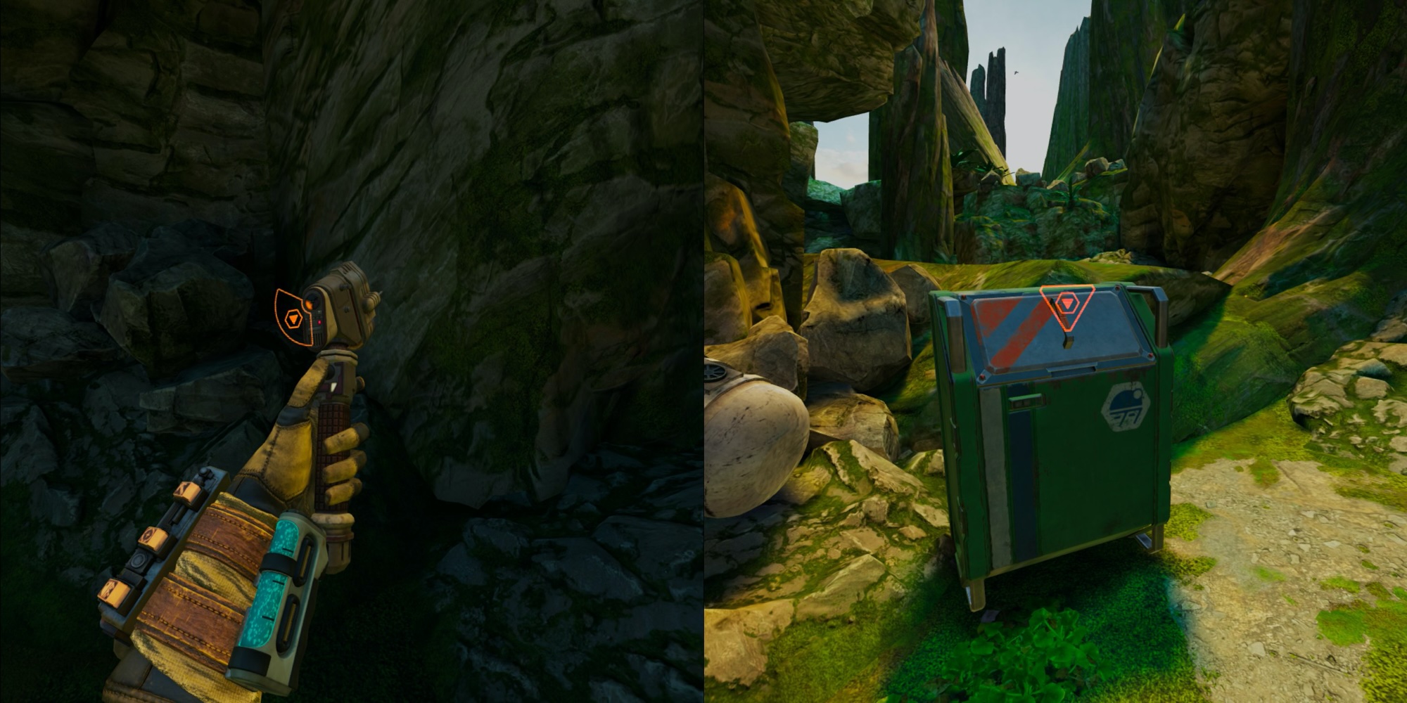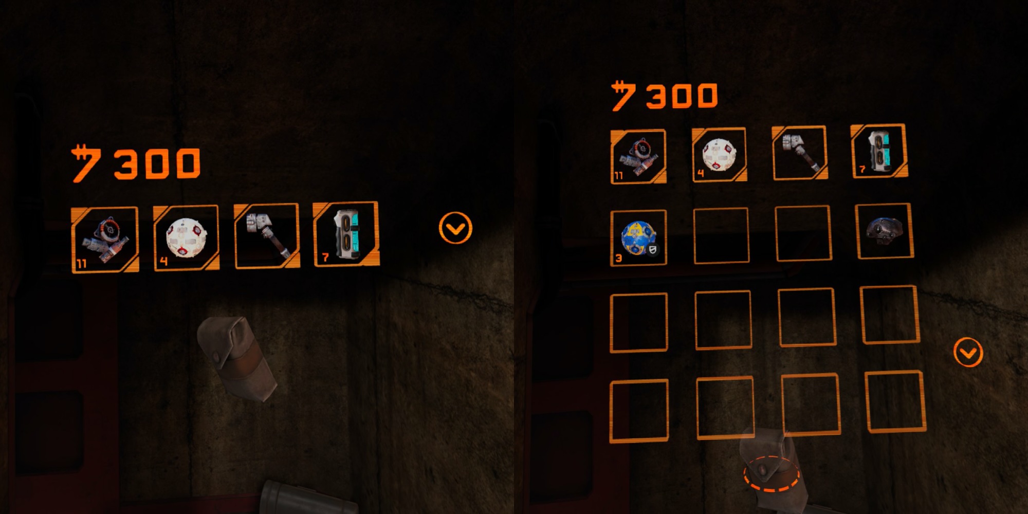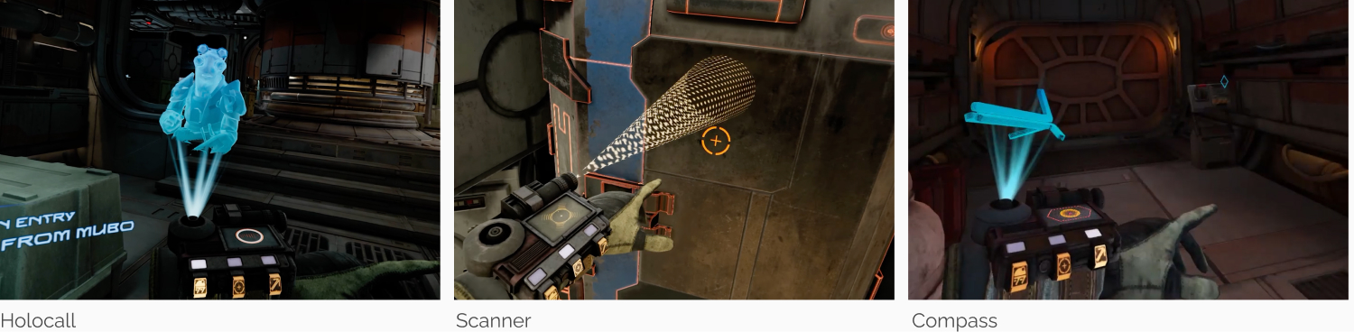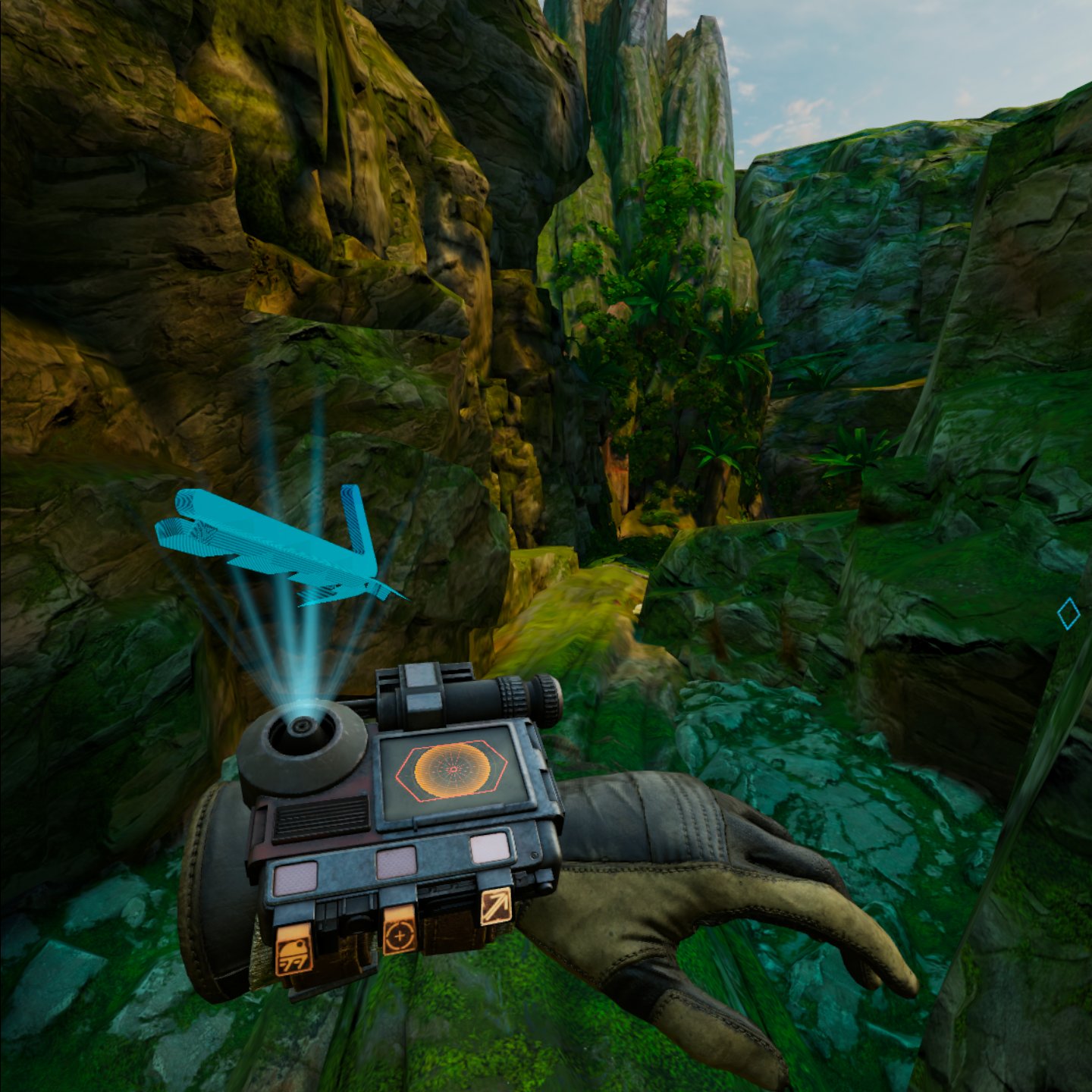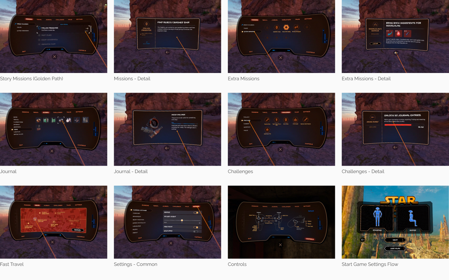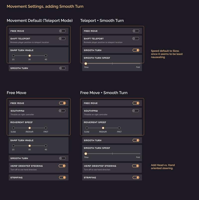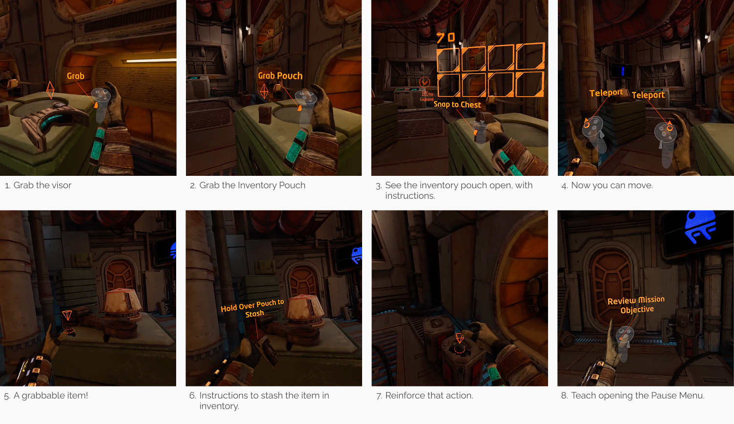
As the UI Lead, I owned end-to-end design for all in-game UI features: menus, typography, icons, AR-in-VR HUD elements, custom UI shaders, tutorials, localization, settings, and motion graphics.
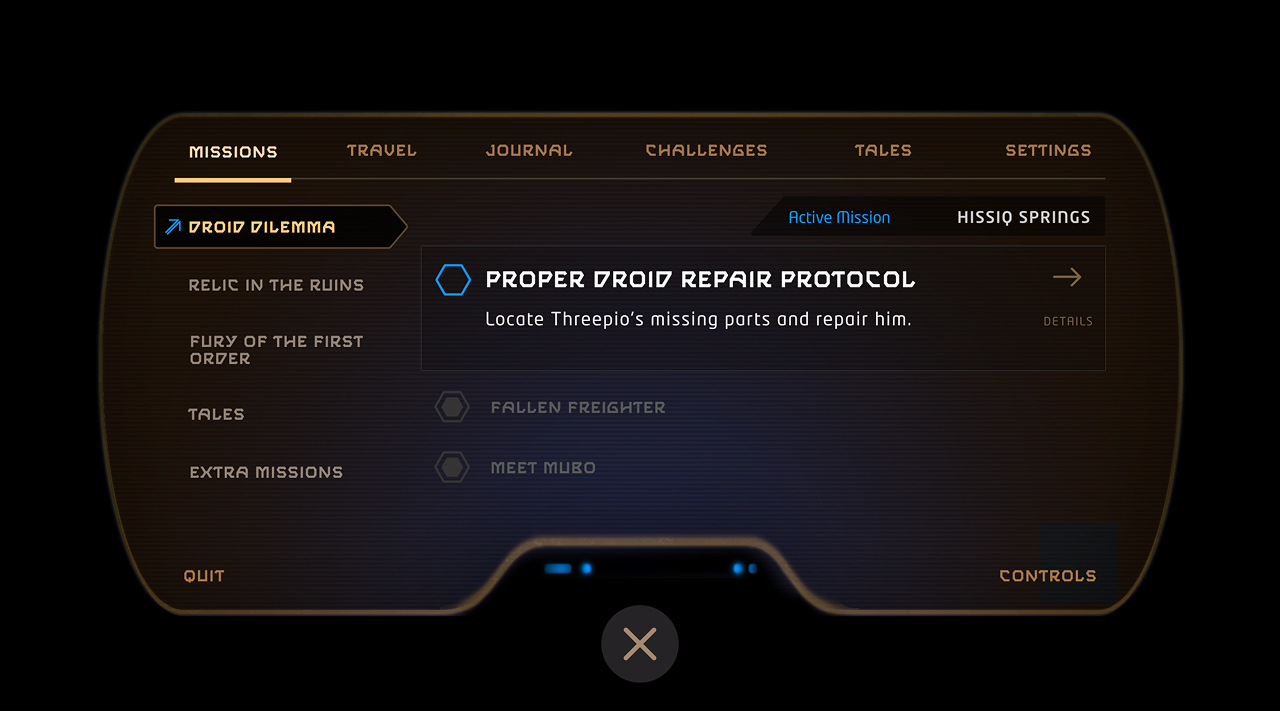
I also designed the mission progression, challenges, and journal systems, untangling the complexity of nonlinear story progression. Worked closely with the art director, game design leads, and engineering leads. Shipped in Unreal Engine.