Quill Gallery
Oculus Story Studio
2017
UX/UI Design & Prototyping
This is a concept for a VR app to showcase content made with Quill. Quill artists were making artwork, animations, and comics, and the studio wanted to showcase these in a cohesive fashion.
I designed and built a prototype for the Story Studio team to evaluate scope and direction for the idea with Oculus management.
Visual Design
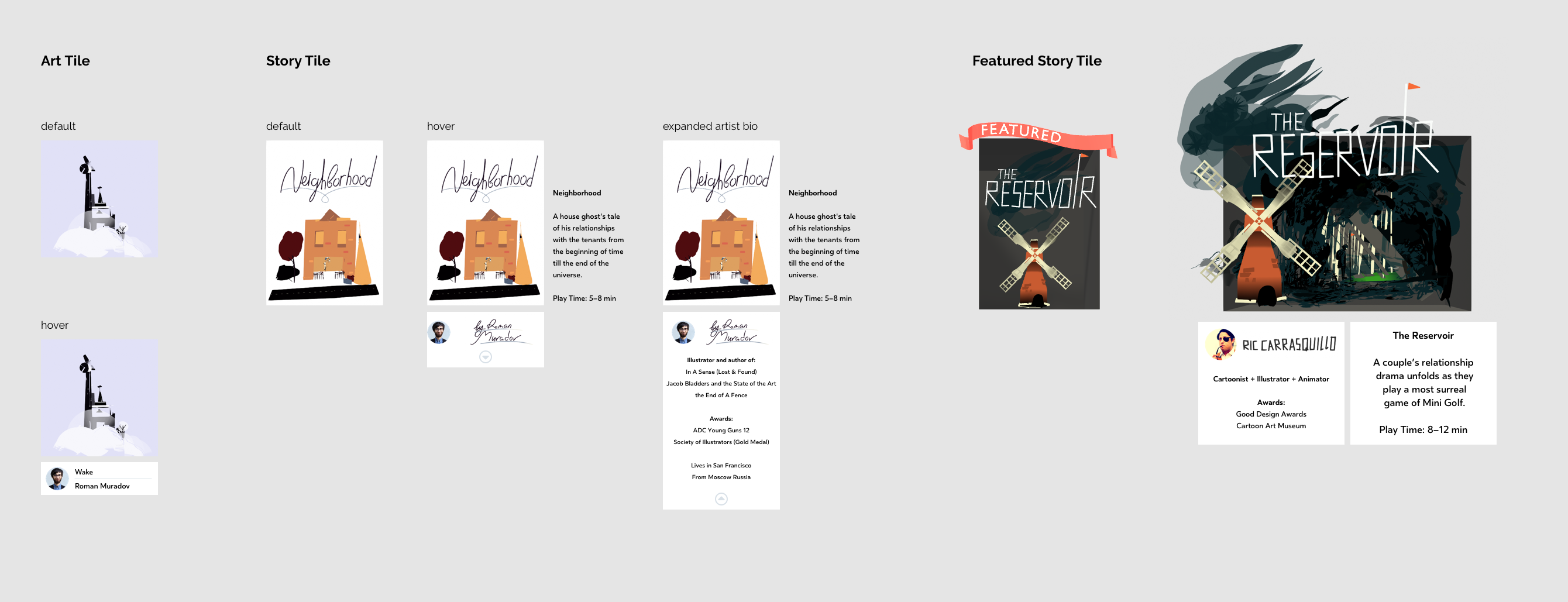
Most VR content apps simply use flat thumbnails, but I felt that really did not capture the artistry of the pieces, brand of the studio, and ethos of showcasing individual artists.
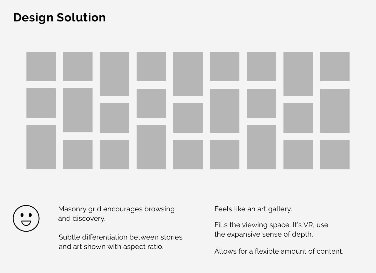
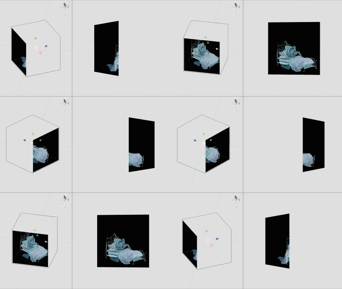
I exported out selections from Quill artworks to create these shadowboxes that are both a browse-able bookshelf as well as each a portal into their own world.
This design reflects the 2D/3D look of Quill scenes. The outside of the boxes simply has the same flat color as the background, creating the flat optical illusion. (Thanks to Inigo for this idea!)
These thumbnails could also be animated Quill loops.
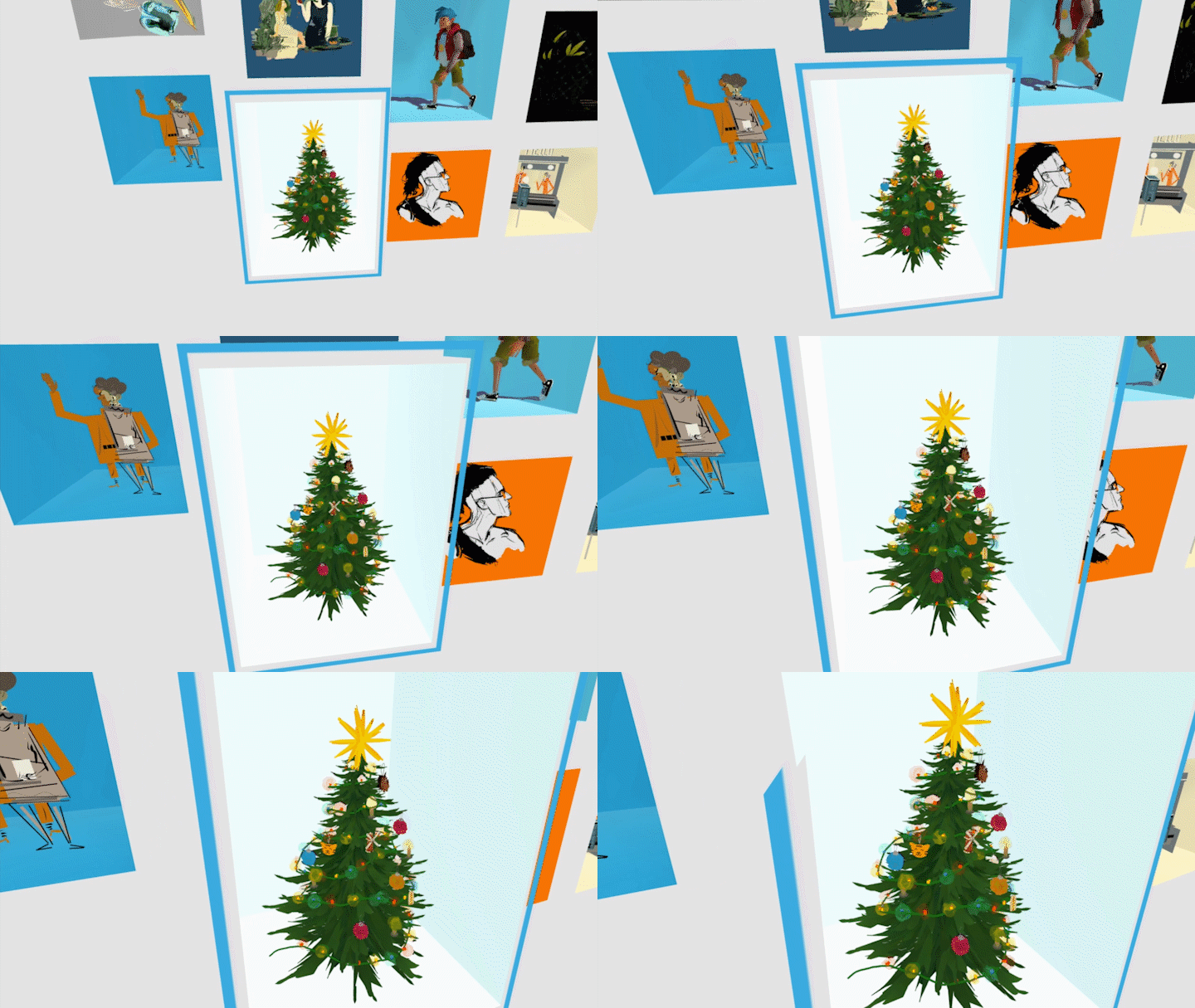
Lean In for Details
Feedback on the design was very positive.
People really liked leaning in to see the details in each drawing. This was great for getting people to slow down and consider each piece, since our content isn't anchored on well-known titles or franchises.
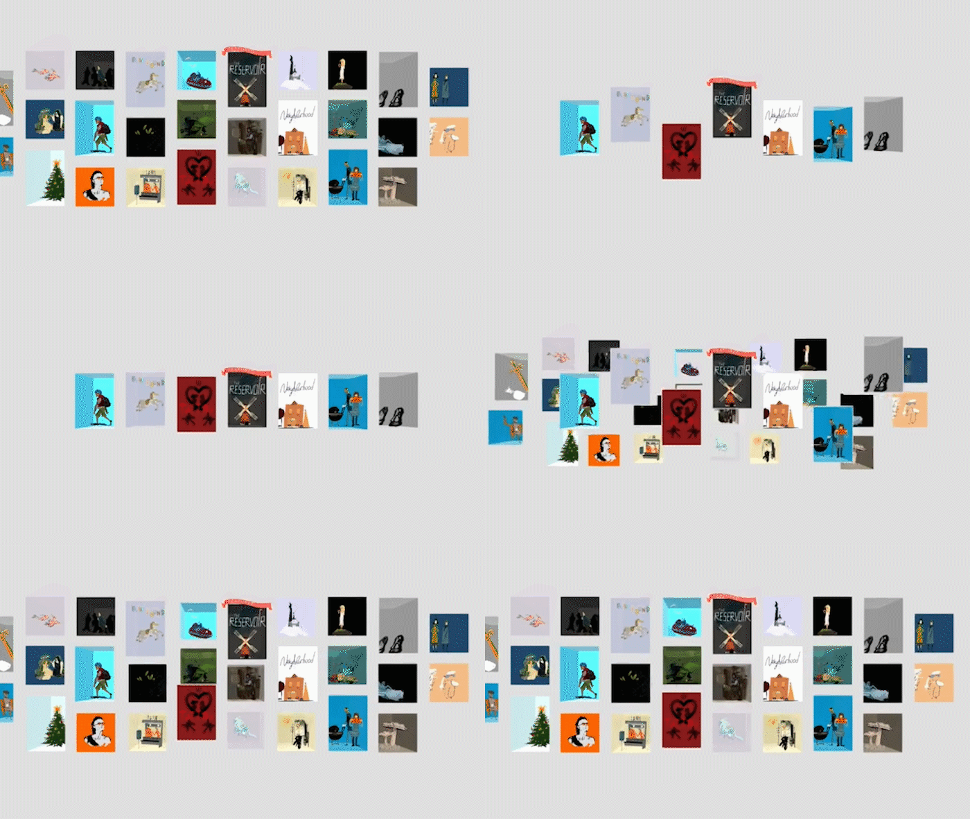
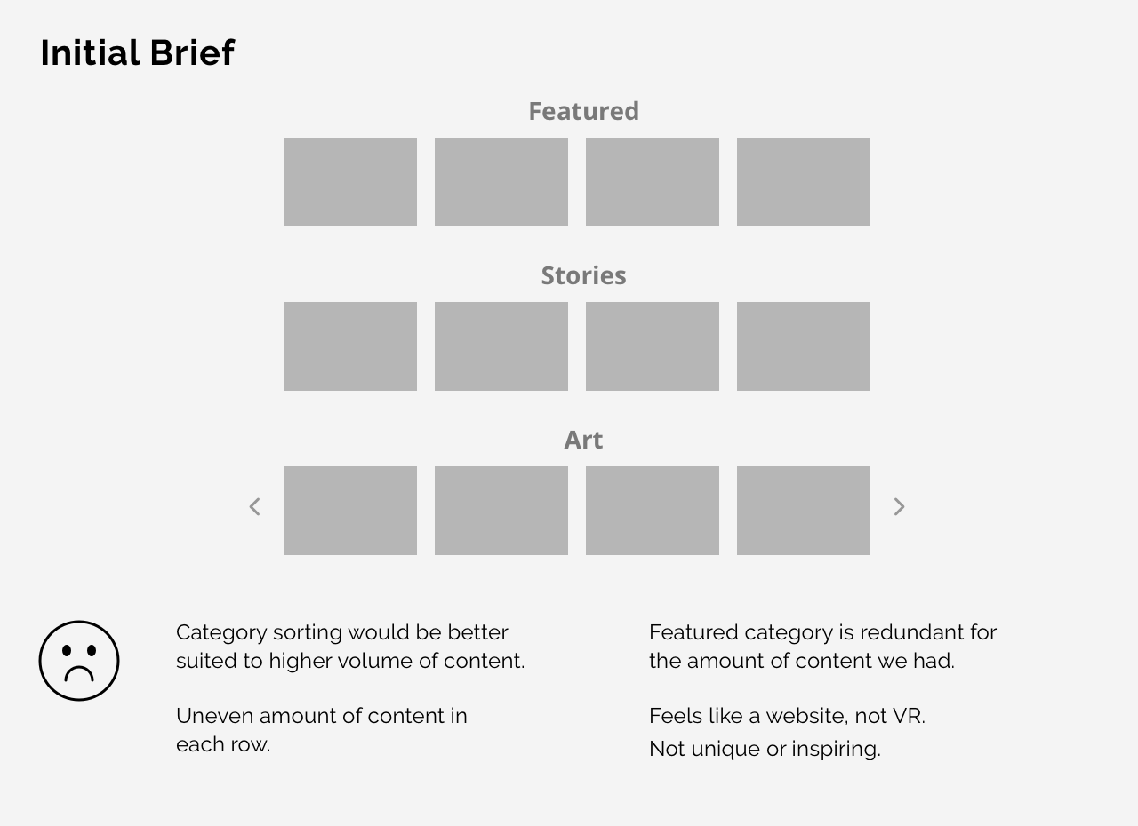
Sort
Later, if we had enough content so that categories or other sorting would be helpful, the 3D gallery would still work. This layout proves flexible for a wide range of content volume and features.