Quill
Oculus Story Studio
2016-2017
UX/UI Design & Prototyping
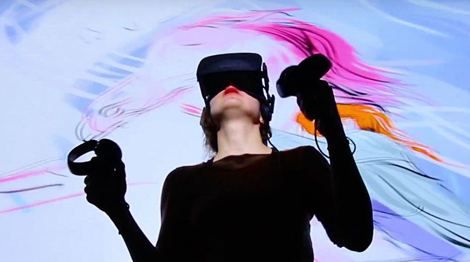
Quill is a VR drawing tool for professional artists. Create immersive artworks by drawing in 3D space.
Quill was developed in-house at Oculus Story Studio as a production tool. It already had a lot of features that supported an entire creative workflow.
Unique amongst VR apps, studio artists used Quill for long periods of time — up to 8 hours a day!
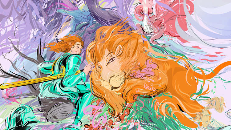
Here is a Quill artwork by artist Wesley Allsbrook for the film "Dear Angelica". Quill scenes often have thousands of strokes and dozens of layers.
The Beta
With an initial short deadline to ship a beta for the Oculus Rift Touch controller launch, I focused on key usability features like the cursor, active states, and menu navigation that would be essential for a new user to use the app.
Read more about the beta launch here:
Oculus Blog Post
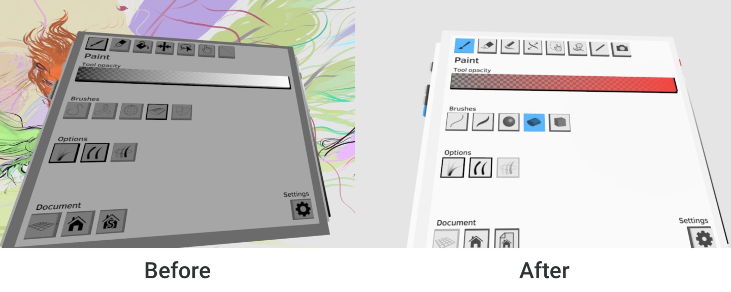
The old UI was built on a cube that you rotated.
Doing some ad hoc user research, I quickly saw that people found this to be confusing. Splitting it into panels with icons to identify each menu was a safe navigation improvement that didn’t take much dev time. Also, now we could add in a 5th panel for the gallery.
Post-launch, I worked on interface concepts for future features and VR interaction.
I found that some very rewarding VR design ideas are very grounded in practical constraints. Since artists actually use Quill for hours at a time, ergonomics are a primary concern because your arms get tired.
VR is so different from flat screen interfaces, thus I spent most of my time making prototypes in Unity to try out interaction ideas in 3D.
Artists using Quill are deeply passionate and opinionated about the tool, and I worked with the team to collect and organize our large backlog of feature requests. Here are some of the features I worked on...
Moveable Menus
Place a menu anywhere you like, and hide them if desired. This was the immediate logical progression of the menus, based on user feedback.
Specifically, artists wanted to have the color menu separate from the main menu, and closer to their drawing hand so it would be easier to reach. This design is generally more ergonomic, and now you can use both of your hands. (Before, the menu is attached at a fixed point on the your left hand.)
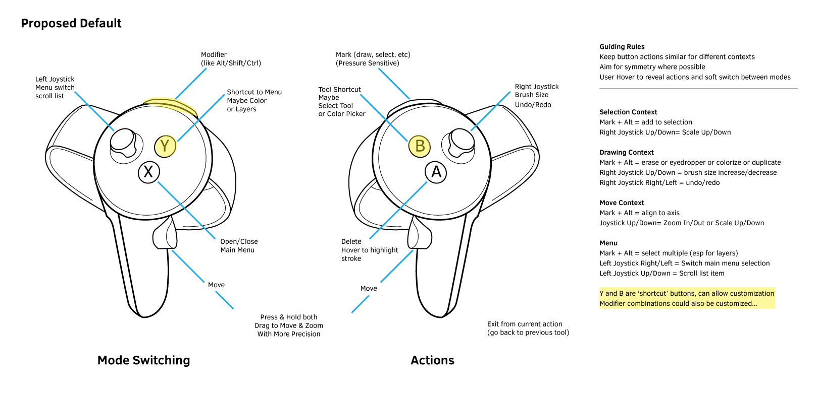
The "Alt" button
The touch controllers are designed primarily for gaming, and thus only have a few buttons.
Artists commonly use many keyboard shortcuts while working.
To pack in more shortcuts, we came up with the idea of using the left trigger button as an “Alt” button. Combine Alt with any other button, thus doubling the number of shortcuts. This is similar to how keyboard shortcuts are mapped in many desktop tools.
Transform Tool
It's easy to grab and move things in Quill, but artists wanted axis-constrained translate and rotation.
I made 4-5 iterations on this one. In this prototype, I packed in a lot of features to try out. Along with moving and rotating on just one axis, it also includes moving the pivot point, navigating up/down in grouping, and duplicating.
The duplicating feature became a quick favorite for the artists.
Button mapping:
Alt + Grab = Duplicate
Right Joystick Right = Repeat Last (can duplicate with same transform)
Right Joystick Up/Down = parent/child layer groups
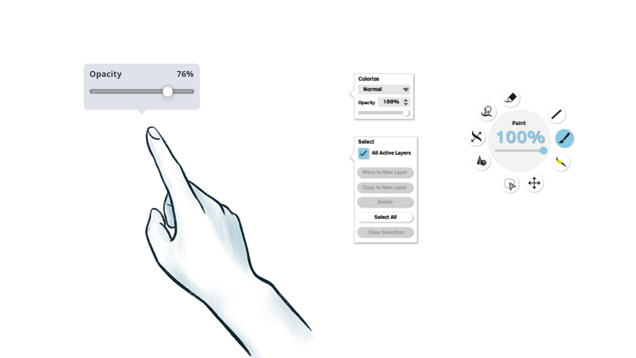
Interaction Concept: Shortcut Gesture
You can do a 'point' gesture on the Touch controllers by lifting your index finger.
I found that this could be used to trigger a shortcut. A bit like a right mouse click, but more minimal.
I hoped to use it for quick, tool specific actions so you wouldn't have to rely on the large menus for everything.
Interaction Concept: Flip Animation Gesture
Initially Quill was focused on only doing frame animation, where the artist draws each frame separately.
Inspired by how traditional animators would flip paper between their fingers to get a feeling for the motion, I designed this flip gesture, which would be activated by extending the left pointer finger.
A simple wrist rotation lets you vary the speed between frames much faster than by using a timeline.
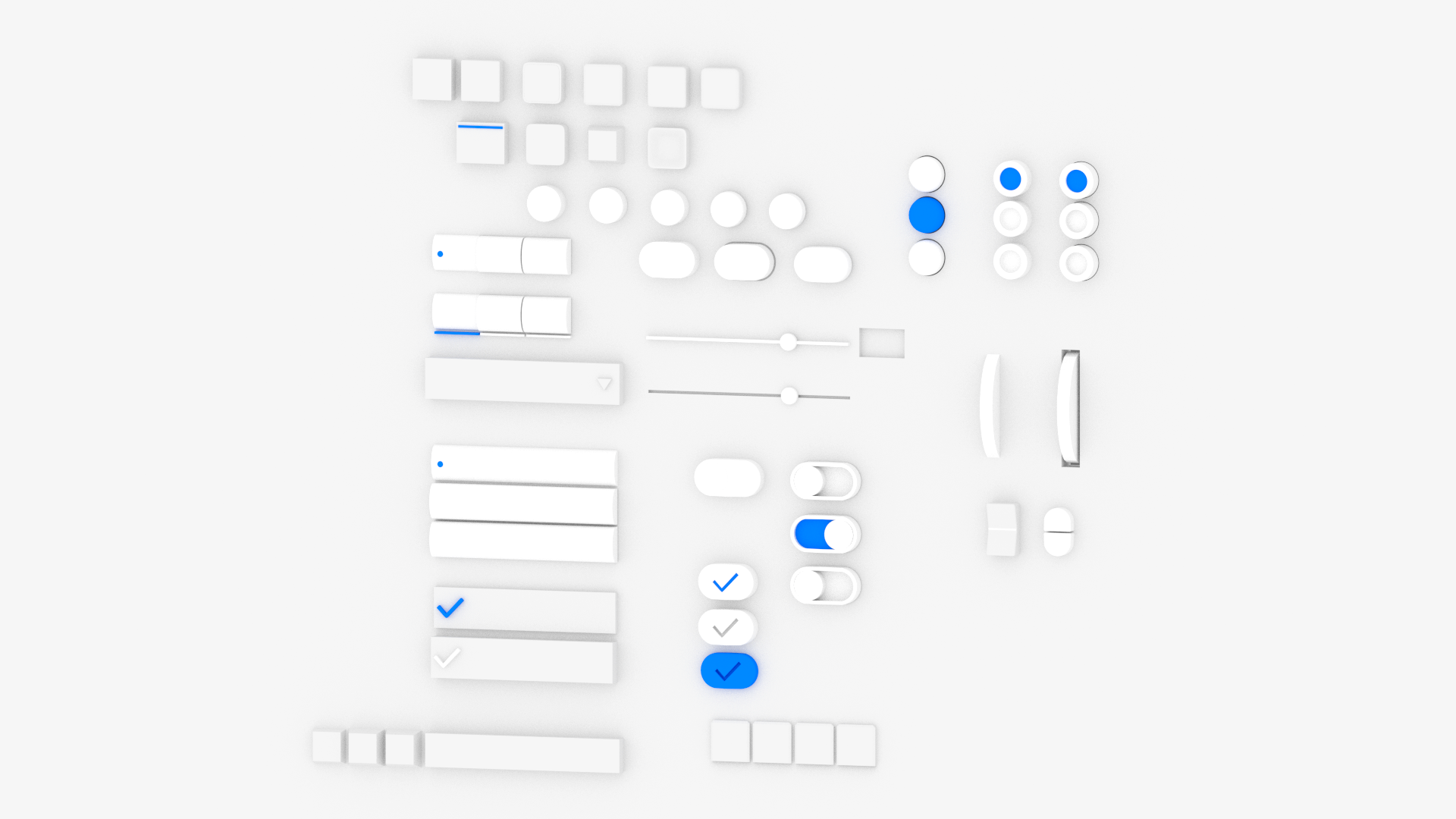
Visual UI Concept
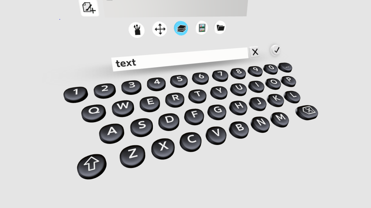
Our concept was to reference real physical buttons. Since Quill drawings are all unlit and unshaded, making the UI have tangible materiality would help differentiate it from the rest of the scene.
I modeled a bunch of different 3D buttons to play around with the idea.
Found that matcaps a practical solution to doing pre-baked materials + lighting for real-time.
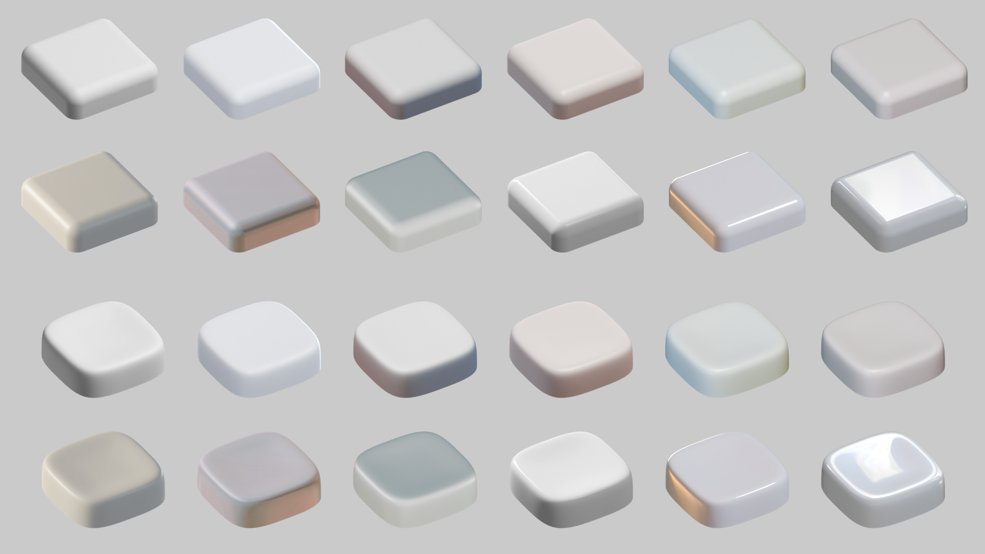
Materials tests using matcaps. Adding a soft curve to the button shape greatly impacts the look of the material.
